

Howdy!
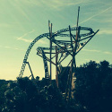
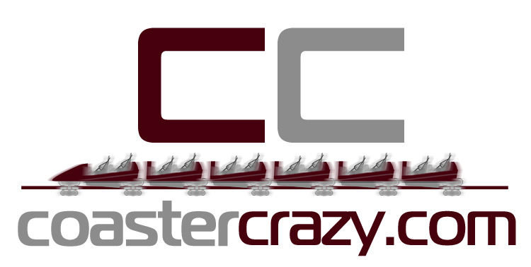
I think I've visited this topic before but never made it into something concrete. I'm looking for an official coastercrazy logo. Something that can be printed so the logo shouldn't have like blurring and stuff that wouldn't translate well into printed items like shirts. I looked up our old logos of the past and found the cc guy and the most recent one. I like the most recent one but the train on it is blurred as to show motion effect. Check them out, ccguy first followed by the most recent one:
http://www.coastercrazy.com/forum/file_ ... _ccguy.jpg
and
http://www.coastercrazy.com/forum/file_ ... cclogo.jpg
Like I said, that last one is the better of the two. Anyone up to clean it up and make it into a high resolution PSD we could use for print? Let me know or if you want something entirely new, post it here and we just may go with it.
Thanks!
Board index ‹ Public Relations ‹ Site Related ‹ Coaster Crazy Logo
 November 14th, 2013, 7:43 pm

Coaster Crazy Logo
11 posts
• Page 1 of 1
Support Us! - Click Here To Donate $5 Monthly!
Paradox wrote:
No need to tell Oscar about the problems. He is magic.
I can't, but I bet if someone vector-traced the last design to where the blurs would just be cut off, and then scaled it up and remade it, then you could have that work.
I miss going to the red CoasterCrazy when coastercrazy was around 
I have the feeling that the second logo contains official Intamin drawings:
http://data.sphosting.ch/Intamin/Media/Mega%20Coaster/Mega_Coaster.pdf
http://data.sphosting.ch/Intamin/Media/Mega%20Coaster/Mega_Coaster.pdf
hmmm looks very similar indeed but none of the renderings in the pdf are the same as the one in the second logo. Though starting from scratch would free us from any problems.
Support Us! - Click Here To Donate $5 Monthly!
Paradox wrote:
No need to tell Oscar about the problems. He is magic.


1.

2.

3.

2.
3.
Erase the little bit of track hanging off the left and any of those logos would do.
small/medium/large renders
Image Insert:

42.85?????KB
Image Insert:

89.28?????KB
Image Insert:

62.13?????KB
Image Insert:
42.85?????KB
Image Insert:
89.28?????KB
Image Insert:
62.13?????KB
Support Us! - Click Here To Donate $5 Monthly!
Paradox wrote:
No need to tell Oscar about the problems. He is magic.
up big doesnt look so good on the pale blue background.
Its the jagged edge along the roller coaster. If it could be smooth lines, then it would be fine I think.
Support Us! - Click Here To Donate $5 Monthly!
Paradox wrote:
No need to tell Oscar about the problems. He is magic.

I agree, if it was smooth it'd look far better!
Coaster Count - 198
France 2019 Mini Trip Report
France 2019 Mini Trip Report
11 posts
• Page 1 of 1
-
- Related topics
- Replies
- Views
- Last post
-
- Coaster Crazy is now SSL Enabled
by Mikey » February 12th, 2017, 10:26 pm - 2 Replies
- 2391 Views
- Last post by lol240

February 18th, 2017, 9:30 pm
- Coaster Crazy is now SSL Enabled
-
- The Coaster Crazy Exchange
by Goku1910 » January 2nd, 2018, 8:32 pm - 16 Replies
- 5879 Views
- Last post by Dirk_Ermen
January 15th, 2018, 10:58 am
- The Coaster Crazy Exchange
-
- Coaster Crazy's Secret Project
1, 2by Tetsu » October 5th, 2008, 11:17 pm - 37 Replies
- 7801 Views
- Last post by dragon2000
October 8th, 2008, 7:24 am
- Coaster Crazy's Secret Project
-
- Coaster Crazy Radio Has Launched!
by Oscar » December 14th, 2008, 1:41 am - 2 Replies
- 1677 Views
- Last post by Oscar
December 14th, 2008, 2:05 am
- Coaster Crazy Radio Has Launched!
-
- 2011 Coaster Crazy Trip
by Mikey » February 22nd, 2011, 6:37 pm - 16 Replies
- 4701 Views
- Last post by Tetsu
February 23rd, 2011, 6:13 pm
- 2011 Coaster Crazy Trip
